How to Use React Components from Different UI Library Sites
A comprehensive guide to combining components from Magic UI, Eldora UI, React Bits, and other shadcn-style libraries in your Next.js projects

The Big Picture: What These Libraries Actually Are
Modern UI libraries like Magic UI, Eldora UI, and React Bits follow the shadcn/ui pattern. This is fundamentally different from traditional npm packages:
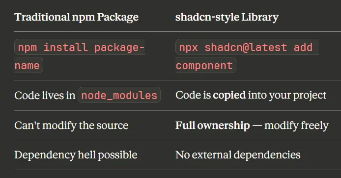
Key insight: These libraries don't ship compiled packages. They provide the source code that becomes part of YOUR project.
This means:
- Components are copied directly into your codebase
- You own and control the code completely
- No hidden dependencies or version conflicts
- Full customization freedom
Components We'll Use
In this tutorial, we'll combine three components from different libraries:
- Hacker Background - Matrix-style falling characters animation Eldora UI
- Terminal - MacOS-style terminal with typing animations Magic uI
- Electric Border (React Bits) - Animated border with SVG turbulence effects React Bits
How to Get Component Source Code
When you visit a component page, you typically see:
- Preview - Live demo of the effect
- Usage code - How to import and use it
- Installation command - CLI command
- Props - Available configuration options
But where's the actual component code? Here are three methods:
Method 1: Use the CLI (Easiest)
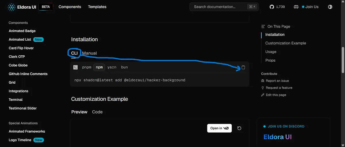
npx shadcn@latest add @eldoraui/hacker-background
This command:
- Connects to the library's registry (e.g.,
eldoraui.site/r/hacker-background) - Downloads the component source code
- Places it in your project (usually
components/eldoraui/)
Tip: After running the CLI, check the new file to see the actual source code.
Method 2: Click the "Manual" Tab
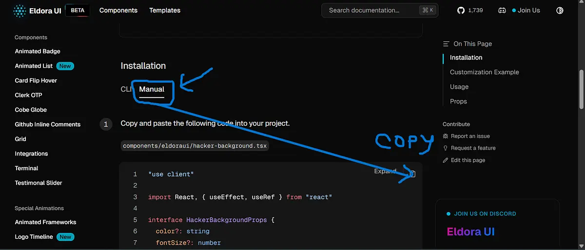
Many component sites have a "Manual" tab in the Installation section that reveals the full source code you can copy directly.
Method 3: Find the GitHub Repository
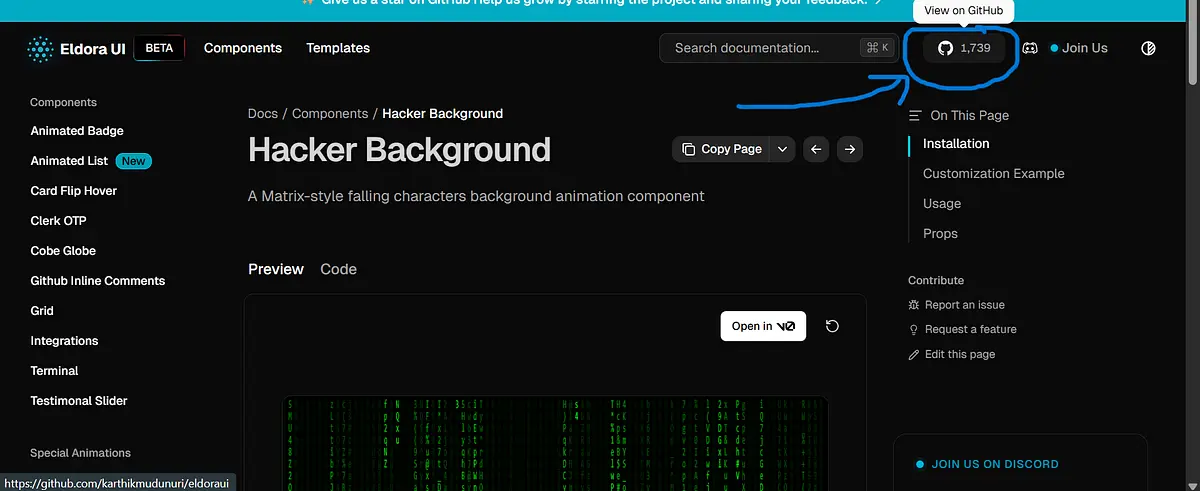
and specific GitHub repo:
Every reputable component library is open source. Find the repo and navigate to the source:
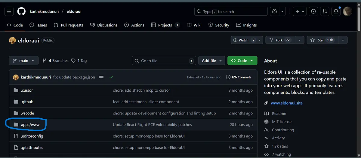
Eldora UI:
- GitHub:
github.com/karthikmudunuri/eldoraui - Path:
apps/www/registry/eldoraui/hacker-background.tsx
Magic UI:
- GitHub:
github.com/magicuidesign/magicui - Path:
registry/magicui/terminal.tsx
Project Setup (One-Time)
Step 1: Create Next.js Project
npx create-next-app@latest my-project --typescript --tailwind --eslint
cd my-project
Step 2: Initialize shadcn/ui
npx shadcn@latest init
Step 3: Install Motion Library
Most animated components require the motion library:
npm install motion
Step 4: Create the Utility Function
Create lib/utils.ts:
import { clsx, type ClassValue } from "clsx"
import { twMerge } from "tailwind-merge"

export function cn(...inputs: ClassValue[]) {
  return twMerge(clsx(inputs))
}
Install dependencies:
npm install clsx tailwind-merge
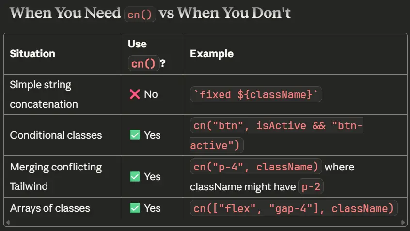
Note: The
cn()utility is not always necessary. Some components use simple template literals instead.
For example, the official Eldora UI code uses a simple template literal:
// Official Eldora UI - simple concatenation
className={`pointer-events-none ${className}`}
if cn( ) utility was required, then the code would look like this:
className={cn("absolute inset-0 h-full w-full", className)}
Folder Structure for Multiple Libraries
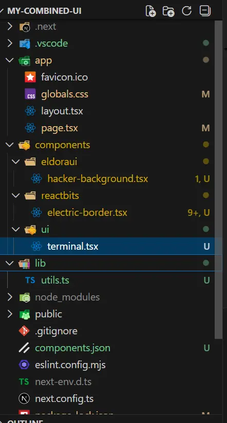
Organize components by their source library:
my-project/
├── components/
│   ├── ui/                    # shadcn/ui & Magic UI
│   │   └── terminal.tsx
│   ├── eldoraui/              # Eldora UI
│   │   └── hacker-background.tsx
│   └── reactbits/             # React Bits
│       └── electric-border.tsx
└── lib/
    └── utils.ts
Practical Example: Hacker Background
Let's add the Hacker Background component from Eldora UI step by step.
Step 1: Try the CLI
npx shadcn@latest add @eldoraui/hacker-background
If successful, check components/eldoraui/hacker-background.tsx - the source is there!
Step 2: If CLI Fails, Go Manual
- Visit:
https://eldoraui.site/docs/components/hacker-background - Scroll to "Installation"
- Click the "Manual" tab
- Copy the entire code
- Create
components/eldoraui/hacker-background.tsx - Paste the code
Step 3: Fix Import Paths
The copied code might have:
import { cn } from "@/lib/utils"
Make sure this matches YOUR project's utility file location.
Step 4: Component Implementation
components/eldoraui/hacker-background.tsx:
"use client"

import React, { useEffect, useRef } from "react"

interface HackerBackgroundProps {
  color?: string
  fontSize?: number
  className?: string
  speed?: number
}

export const HackerBackground: React.FC<HackerBackgroundProps> = ({
  color = "#0F0",
  fontSize = 14,
  className = "",
  speed = 1,
}) => {
  const canvasRef = useRef<HTMLCanvasElement>(null)

  useEffect(() => {
    const canvas = canvasRef.current
    if (!canvas) return

    const ctx = canvas.getContext("2d")
    if (!ctx) return

    const resizeCanvas = () => {
      canvas.width = window.innerWidth
      canvas.height = window.innerHeight
    }

    resizeCanvas()
    window.addEventListener("resize", resizeCanvas)

    let animationFrameId: number
    const columns = Math.floor(canvas.width / fontSize)
    const drops: number[] = new Array(columns).fill(1)

    const chars =
      "ABCDEFGHIJKLMNOPQRSTUVWXYZabcdefghijklmnopqrstuvwxyz0123456789@#$%^&*()_+"

    let lastTime = 0
    const interval = 33 // ~30 fps

    const draw = (currentTime: number) => {
      animationFrameId = requestAnimationFrame(draw)

      if (currentTime - lastTime < interval) return
      lastTime = currentTime

      ctx.fillStyle = "rgba(0, 0, 0, 0.05)"
      ctx.fillRect(0, 0, canvas.width, canvas.height)

      ctx.fillStyle = color
      ctx.font = `${fontSize}px monospace`

      for (let i = 0; i < drops.length; i++) {
        const text = chars[Math.floor(Math.random() * chars.length)]
        ctx.fillText(text, i * fontSize, drops[i] * fontSize)

        if (drops[i] * fontSize > canvas.height && Math.random() > 0.975) {
          drops[i] = 0
        }

        drops[i] += speed // Use the speed prop to control fall rate
      }
    }

    animationFrameId = requestAnimationFrame(draw)

    return () => {
      window.removeEventListener("resize", resizeCanvas)
      cancelAnimationFrame(animationFrameId)
    }
  }, [color, fontSize, speed])

  return (
    <canvas
      ref={canvasRef}
      className={`pointer-events-none ${className}`}
      style={{
        position: "absolute",
        top: 0,
        left: 0,
        width: "100%",
        height: "100%",
      }}
    />
  )
}
The code for components/reactbits/electric-border.tsx:
"use client"

import React, {
  CSSProperties,
  PropsWithChildren,
  useEffect,
  useId,
  useLayoutEffect,
  useRef
} from "react"

type ElectricBorderProps = PropsWithChildren<{
  color?: string
  speed?: number
  chaos?: number
  thickness?: number
  className?: string
  style?: CSSProperties
}>

function hexToRgba(hex: string, alpha = 1): string {
  if (!hex) return `rgba(0,0,0,${alpha})`
  let h = hex.replace("#", "")
  if (h.length === 3) {
    h = h
      .split("")
      .map((c) => c + c)
      .join("")
  }
  const int = parseInt(h, 16)
  const r = (int >> 16) & 255
  const g = (int >> 8) & 255
  const b = int & 255
  return `rgba(${r}, ${g}, ${b}, ${alpha})`
}

const ElectricBorder: React.FC<ElectricBorderProps> = ({
  children,
  color = "#5227FF",
  speed = 1,
  chaos = 1,
  thickness = 2,
  className,
  style,
}) => {
  const rawId = useId().replace(/[:]/g, "")
  const filterId = `turbulent-displace-${rawId}`
  const svgRef = useRef<SVGSVGElement | null>(null)
  const rootRef = useRef<HTMLDivElement | null>(null)
  const strokeRef = useRef<HTMLDivElement | null>(null)

  const updateAnim = () => {
    const svg = svgRef.current
    const host = rootRef.current
    if (!svg || !host) return

    if (strokeRef.current) {
      strokeRef.current.style.filter = `url(#${filterId})`
    }

    const width = Math.max(
      1,
      Math.round(host.clientWidth || host.getBoundingClientRect().width || 0)
    )
    const height = Math.max(
      1,
      Math.round(host.clientHeight || host.getBoundingClientRect().height || 0)
    )

    const dyAnims = Array.from(
      svg.querySelectorAll<SVGAnimateElement>(
        'feOffset > animate[attributeName="dy"]'
      )
    )
    if (dyAnims.length >= 2) {
      dyAnims[0].setAttribute("values", `${height}; 0`)
      dyAnims[1].setAttribute("values", `0; -${height}`)
    }

    const dxAnims = Array.from(
      svg.querySelectorAll<SVGAnimateElement>(
        'feOffset > animate[attributeName="dx"]'
      )
    )
    if (dxAnims.length >= 2) {
      dxAnims[0].setAttribute("values", `${width}; 0`)
      dxAnims[1].setAttribute("values", `0; -${width}`)
    }

    const baseDur = 6
    const dur = Math.max(0.001, baseDur / (speed || 1))
    ;[...dyAnims, ...dxAnims].forEach((a) => a.setAttribute("dur", `${dur}s`))

    const disp = svg.querySelector("feDisplacementMap")
    if (disp) disp.setAttribute("scale", String(30 * (chaos || 1)))

    const filterEl = svg.querySelector<SVGFilterElement>(
      `#${CSS.escape(filterId)}`
    )
    if (filterEl) {
      filterEl.setAttribute("x", "-200%")
      filterEl.setAttribute("y", "-200%")
      filterEl.setAttribute("width", "500%")
      filterEl.setAttribute("height", "500%")
    }

    requestAnimationFrame(() => {
      ;[...dyAnims, ...dxAnims].forEach((a: SVGAnimateElement) => {
        if (typeof a.beginElement === "function") {
          try {
            a.beginElement()
          } catch {
            // Ignore errors
          }
        }
      })
    })
  }

  useEffect(() => {
    updateAnim()
  }, [speed, chaos])

  useLayoutEffect(() => {
    if (!rootRef.current) return
    const ro = new ResizeObserver(() => updateAnim())
    ro.observe(rootRef.current)
    updateAnim()
    return () => ro.disconnect()
  }, [])

  const inheritRadius: CSSProperties = {
    borderRadius: style?.borderRadius ?? "inherit",
  }

  const strokeStyle: CSSProperties = {
    ...inheritRadius,
    borderWidth: thickness,
    borderStyle: "solid",
    borderColor: color,
  }

  const glow1Style: CSSProperties = {
    ...inheritRadius,
    borderWidth: thickness,
    borderStyle: "solid",
    borderColor: hexToRgba(color, 0.6),
    filter: `blur(${0.5 + thickness * 0.25}px)`,
    opacity: 0.5,
  }

  const glow2Style: CSSProperties = {
    ...inheritRadius,
    borderWidth: thickness,
    borderStyle: "solid",
    borderColor: color,
    filter: `blur(${2 + thickness * 0.5}px)`,
    opacity: 0.5,
  }

  const bgGlowStyle: CSSProperties = {
    ...inheritRadius,
    transform: "scale(1.08)",
    filter: "blur(32px)",
    opacity: 0.3,
    zIndex: -1,
    background: `linear-gradient(-30deg, ${hexToRgba(color, 0.8)}, transparent, ${color})`,
  }

  return (
    <div
      ref={rootRef}
      className={"relative isolate " + (className ?? "")}
      style={style}
    >
      <svg
        ref={svgRef}
        className="fixed -left-[10000px] -top-[10000px] h-[10px] w-[10px] pointer-events-none opacity-[0.001]"
        aria-hidden
        focusable="false"
      >
        <defs>
          <filter
            id={filterId}
            colorInterpolationFilters="sRGB"
            x="-20%"
            y="-20%"
            width="140%"
            height="140%"
          >
            <feTurbulence
              type="turbulence"
              baseFrequency="0.02"
              numOctaves="10"
              result="noise1"
              seed="1"
            />
            <feOffset in="noise1" dx="0" dy="0" result="offsetNoise1">
              <animate
                attributeName="dy"
                values="700; 0"
                dur="6s"
                repeatCount="indefinite"
                calcMode="linear"
              />
            </feOffset>

            <feTurbulence
              type="turbulence"
              baseFrequency="0.02"
              numOctaves="10"
              result="noise2"
              seed="1"
            />
            <feOffset in="noise2" dx="0" dy="0" result="offsetNoise2">
              <animate
                attributeName="dy"
                values="0; -700"
                dur="6s"
                repeatCount="indefinite"
                calcMode="linear"
              />
            </feOffset>

            <feTurbulence
              type="turbulence"
              baseFrequency="0.02"
              numOctaves="10"
              result="noise1"
              seed="2"
            />
            <feOffset in="noise1" dx="0" dy="0" result="offsetNoise3">
              <animate
                attributeName="dx"
                values="490; 0"
                dur="6s"
                repeatCount="indefinite"
                calcMode="linear"
              />
            </feOffset>

            <feTurbulence
              type="turbulence"
              baseFrequency="0.02"
              numOctaves="10"
              result="noise2"
              seed="2"
            />
            <feOffset in="noise2" dx="0" dy="0" result="offsetNoise4">
              <animate
                attributeName="dx"
                values="0; -490"
                dur="6s"
                repeatCount="indefinite"
                calcMode="linear"
              />
            </feOffset>

            <feComposite in="offsetNoise1" in2="offsetNoise2" result="part1" />
            <feComposite in="offsetNoise3" in2="offsetNoise4" result="part2" />
            <feBlend
              in="part1"
              in2="part2"
              mode="color-dodge"
              result="combinedNoise"
            />
            <feDisplacementMap
              in="SourceGraphic"
              in2="combinedNoise"
              scale="30"
              xChannelSelector="R"
              yChannelSelector="B"
            />
          </filter>
        </defs>
      </svg>

      <div
        className="absolute inset-0 pointer-events-none"
        style={inheritRadius}
      >
        <div
          ref={strokeRef}
          className="absolute inset-0 box-border"
          style={strokeStyle}
        />
        <div className="absolute inset-0 box-border" style={glow1Style} />
        <div className="absolute inset-0 box-border" style={glow2Style} />
        <div className="absolute inset-0" style={bgGlowStyle} />
      </div>

      <div className="relative" style={inheritRadius}>
        {children}
      </div>
    </div>
  )
}

export default ElectricBorder
The code for components/ui/terminal.tsx:
"use client"

import {
  Children,
  createContext,
  useContext,
  useEffect,
  useMemo,
  useRef,
  useState,
} from "react"
import { motion, MotionProps, useInView } from "motion/react"

import { cn } from "@/lib/utils"

interface SequenceContextValue {
  completeItem: (index: number) => void
  activeIndex: number
  sequenceStarted: boolean
}

const SequenceContext = createContext<SequenceContextValue | null>(null)

const useSequence = () => useContext(SequenceContext)

const ItemIndexContext = createContext<number | null>(null)
const useItemIndex = () => useContext(ItemIndexContext)

interface AnimatedSpanProps extends MotionProps {
  children: React.ReactNode
  delay?: number
  className?: string
  startOnView?: boolean
}

export const AnimatedSpan = ({
  children,
  delay = 0,
  className,
  startOnView = false,
  ...props
}: AnimatedSpanProps) => {
  const elementRef = useRef<HTMLDivElement | null>(null)
  const isInView = useInView(elementRef as React.RefObject<Element>, {
    amount: 0.3,
    once: true,
  })

  const sequence = useSequence()
  const itemIndex = useItemIndex()
  const [hasStarted, setHasStarted] = useState(false)

  useEffect(() => {
    if (!sequence || itemIndex === null) return
    if (!sequence.sequenceStarted) return
    if (hasStarted) return
    if (sequence.activeIndex === itemIndex) {
      setHasStarted(true)
    }
    // eslint-disable-next-line react-hooks/exhaustive-deps
  }, [sequence?.activeIndex, sequence?.sequenceStarted, hasStarted, itemIndex])

  const shouldAnimate = sequence ? hasStarted : startOnView ? isInView : true

  return (
    <motion.div
      ref={elementRef}
      initial={{ opacity: 0, y: -5 }}
      animate={shouldAnimate ? { opacity: 1, y: 0 } : { opacity: 0, y: -5 }}
      transition={{ duration: 0.3, delay: sequence ? 0 : delay / 1000 }}
      className={cn("grid text-sm font-normal tracking-tight", className)}
      onAnimationComplete={() => {
        if (!sequence) return
        if (itemIndex === null) return
        sequence.completeItem(itemIndex)
      }}
      {...props}
    >
      {children}
    </motion.div>
  )
}

interface TypingAnimationProps extends MotionProps {
  children: string
  className?: string
  duration?: number
  delay?: number
  as?: React.ElementType
  startOnView?: boolean
}

export const TypingAnimation = ({
  children,
  className,
  duration = 60,
  delay = 0,
  as: Component = "span",
  startOnView = true,
  ...props
}: TypingAnimationProps) => {
  if (typeof children !== "string") {
    throw new Error("TypingAnimation: children must be a string.")
  }

  const MotionComponent = useMemo(
    () =>
      motion.create(Component, {
        forwardMotionProps: true,
      }),
    [Component]
  )

  const [displayedText, setDisplayedText] = useState<string>("")
  const [started, setStarted] = useState(false)
  const elementRef = useRef<HTMLElement | null>(null)
  const isInView = useInView(elementRef as React.RefObject<Element>, {
    amount: 0.3,
    once: true,
  })

  const sequence = useSequence()
  const itemIndex = useItemIndex()

  // Store sequence.completeItem in a ref to avoid dependency issues
  const completeItemRef = useRef(sequence?.completeItem)
  completeItemRef.current = sequence?.completeItem

  useEffect(() => {
    if (sequence && itemIndex !== null) {
      if (!sequence.sequenceStarted) return
      if (started) return
      if (sequence.activeIndex === itemIndex) {
        setStarted(true)
      }
      return
    }

    if (!startOnView) {
      const startTimeout = setTimeout(() => setStarted(true), delay)
      return () => clearTimeout(startTimeout)
    }

    if (!isInView) return

    const startTimeout = setTimeout(() => setStarted(true), delay)
    return () => clearTimeout(startTimeout)
    // eslint-disable-next-line react-hooks/exhaustive-deps
  }, [
    delay,
    startOnView,
    isInView,
    started,
    sequence?.activeIndex,
    sequence?.sequenceStarted,
    itemIndex,
  ])

  useEffect(() => {
    if (!started) return

    let i = 0
    const typingEffect = setInterval(() => {
      if (i < children.length) {
        setDisplayedText(children.substring(0, i + 1))
        i++
      } else {
        clearInterval(typingEffect)
        // Use ref to call completeItem without adding sequence to deps
        if (completeItemRef.current && itemIndex !== null) {
          completeItemRef.current(itemIndex)
        }
      }
    }, duration)

    return () => {
      clearInterval(typingEffect)
    }
    // Intentionally omitting sequence from deps to prevent restart on sequence change

  }, [children, duration, started, itemIndex])

  return (
    <MotionComponent
      ref={elementRef}
      className={cn("text-sm font-normal tracking-tight", className)}
      {...props}
    >
      {displayedText}
    </MotionComponent>
  )
}

interface TerminalProps {
  children: React.ReactNode
  className?: string
  sequence?: boolean
  startOnView?: boolean
}

export const Terminal = ({
  children,
  className,
  sequence = true,
  startOnView = true,
}: TerminalProps) => {
  const containerRef = useRef<HTMLDivElement | null>(null)
  const isInView = useInView(containerRef as React.RefObject<Element>, {
    amount: 0.3,
    once: true,
  })

  const [activeIndex, setActiveIndex] = useState(0)
  const sequenceHasStarted = sequence ? !startOnView || isInView : false

  const contextValue = useMemo<SequenceContextValue | null>(() => {
    if (!sequence) return null
    return {
      completeItem: (index: number) => {
        setActiveIndex((current) => (index === current ? current + 1 : current))
      },
      activeIndex,
      sequenceStarted: sequenceHasStarted,
    }
  }, [sequence, activeIndex, sequenceHasStarted])

  const wrappedChildren = useMemo(() => {
    if (!sequence) return children
    const array = Children.toArray(children)
    return array.map((child, index) => (
      <ItemIndexContext.Provider key={index} value={index}>
        {child as React.ReactNode}
      </ItemIndexContext.Provider>
    ))
  }, [children, sequence])

  const content = (
    <div
      ref={containerRef}
      className={cn(
        "border-border bg-background z-0 h-full max-h-[400px] w-full max-w-lg rounded-xl border",
        className
      )}
    >
      <div className="border-border flex flex-col gap-y-2 border-b p-4">
        <div className="flex flex-row gap-x-2">
          <div className="h-2 w-2 rounded-full bg-red-500"></div>
          <div className="h-2 w-2 rounded-full bg-yellow-500"></div>
          <div className="h-2 w-2 rounded-full bg-green-500"></div>
        </div>
      </div>
      <pre className="p-4">
        <code className="grid gap-y-1 overflow-auto">{wrappedChildren}</code>
      </pre>
    </div>
  )

  if (!sequence) return content

  return (
    <SequenceContext.Provider value={contextValue}>
      {content}
    </SequenceContext.Provider>
  )
}
Step 5: Use the Component
import { HackerBackground } from "@/components/eldoraui/hacker-background"

export default function Page() {
  return (
    <div className="relative h-screen bg-black">
      <HackerBackground
        color="#22c55e"
        fontSize={14}
        speed={0.5}  // Lower = slower falling
      />
    </div>
  )
}
What If There's No Source Code Visible?
Sometimes a library doesn't show the full source on the website. Here are your options:
Option A: Check GitHub
Find the repository and navigate to the registry folder:
github.com/[owner]/[repo]/tree/main/registry/[library-name]/
Option B: Run CLI and Inspect
Run the CLI command, then open the created file in your editor to see the source code.
Option C: Create a Compatible Implementation
If you understand the component's API and visual effect, you can create your own implementation:
// Compatible implementation based on Eldora UI API
// Original: https://eldoraui.site/docs/components/hacker-background

export const HackerBackground = ({
  color = "#22c55e",
  fontSize = 16,
  speed = 1,
  className,
}) => {
  // Your Canvas-based Matrix rain implementation
}
Important: Always note the original source in a comment when creating compatible implementations.
Step 6: Combining Multiple Libraries
Once you have components from different sources, use them together:
// page.tsx
import { Terminal, TypingAnimation, AnimatedSpan } from "@/components/ui/terminal"
import { HackerBackground } from "@/components/eldoraui/hacker-background"
import ElectricBorder from "@/components/reactbits/electric-border"
export default function Home() {
return (
<div className="relative min-h-screen bg-black text-white overflow-hidden">
{/* Matrix Background Layer */}
<HackerBackground
color="#22c55e"
fontSize={14}
speed={0.5}
className="opacity-50"
/>
{/* Content Layer */}
<div className="relative z-10 flex flex-col items-center justify-center min-h-screen p-6 gap-8">
{/* Hero Section with Electric Border */}
<ElectricBorder
color="#22c55e"
speed={1.2}
chaos={0.6}
thickness={2}
style={{ borderRadius: 20 }}
>
<div className="bg-zinc-900/80 backdrop-blur-md p-8 rounded-[20px]">
<h1 className="text-3xl md:text-5xl font-bold mb-3 bg-linear-to-r from-green-400 to-emerald-500 bg-clip-text text-transparent">
Component Fusion
</h1>
<p className="text-zinc-400 text-lg">
Three UI libraries working together seamlessly.
</p>
</div>
</ElectricBorder>
{/* Terminal Demo */}
<Terminal className="bg-zinc-900/90 backdrop-blur-sm border-zinc-700 shadow-2xl shadow-green-500/20">
<TypingAnimation>> pnpm dlx shadcn@latest init</TypingAnimation>
<AnimatedSpan className="text-green-500">
✔ Preflight checks.
</AnimatedSpan>
<AnimatedSpan className="text-green-500">
✔ Verifying framework. Found Next.js.
</AnimatedSpan>
<AnimatedSpan className="text-green-500">
✔ Validating Tailwind CSS.
</AnimatedSpan>
<AnimatedSpan className="text-green-500">
✔ Validating import alias.
</AnimatedSpan>
<AnimatedSpan className="text-green-500">
✔ Writing components.json.
</AnimatedSpan>
<AnimatedSpan className="text-green-500">
✔ Checking registry.
</AnimatedSpan>
<AnimatedSpan className="text-green-500">
✔ Updating tailwind.config.ts
</AnimatedSpan>
<AnimatedSpan className="text-green-500">
✔ Updating app/globals.css
</AnimatedSpan>
<AnimatedSpan className="text-green-500">
✔ Installing dependencies.
</AnimatedSpan>
<AnimatedSpan className="text-blue-500">
<span>ℹ Updated 1 file:</span>
<span className="pl-2">- lib/utils.ts</span>
</AnimatedSpan>
<TypingAnimation className="text-muted-foreground">
Success! Project initialization completed.
</TypingAnimation>
<TypingAnimation className="text-muted-foreground">
You may now add components.
</TypingAnimation>
</Terminal>
{/* Feature Cards */}
<div className="grid md:grid-cols-3 gap-4 max-w-3xl w-full">
<ElectricBorder
color="#22c55e"
speed={0.8}
chaos={0.4}
thickness={1}
style={{ borderRadius: 12 }}
>
<div className="bg-zinc-900/70 backdrop-blur-sm p-5 rounded-[12px] h-full">
<div className="text-xs text-zinc-500 mb-1">Eldora UI</div>
<h3 className="font-semibold text-lg mb-1">HackerBackground</h3>
<p className="text-zinc-400 text-sm">
Matrix-style falling characters
</p>
</div>
</ElectricBorder>
<ElectricBorder
color="#3b82f6"
speed={0.8}
chaos={0.4}
thickness={1}
style={{ borderRadius: 12 }}
>
<div className="bg-zinc-900/70 backdrop-blur-sm p-5 rounded-[12px] h-full">
<div className="text-xs text-zinc-500 mb-1">Magic UI</div>
<h3 className="font-semibold text-lg mb-1">Terminal</h3>
<p className="text-zinc-400 text-sm">Animated typing sequences</p>
</div>
</ElectricBorder>
<ElectricBorder
color="#a855f7"
speed={0.8}
chaos={0.4}
thickness={1}
style={{ borderRadius: 12 }}
>
<div className="bg-zinc-900/70 backdrop-blur-sm p-5 rounded-[12px] h-full">
<div className="text-xs text-zinc-500 mb-1">React Bits</div>
<h3 className="font-semibold text-lg mb-1">ElectricBorder</h3>
<p className="text-zinc-400 text-sm">
SVG turbulence glow effects
</p>
</div>
</ElectricBorder>
</div>
{/* Footer note */}
<div className="text-center text-zinc-500 text-sm max-w-md mt-4">
<p>
📁 Components are{" "}
<span className="text-zinc-300 font-medium">copied</span> into your
project
</p>
<p className="mt-1">No node_modules dependency - you own the code!</p>
</div>
</div>
</div>
);
}
Common Issues and Solutions
"Module not found" Error
Your import path doesn't match your file location. Check your file structure:
// Using @/ alias (if configured)
import { cn } from "@/lib/utils"

// Using relative paths
import { cn } from "../../lib/utils"
Component Not Animating
Make sure:
"use client"is at the top of the component file- Motion is installed:
npm install motion - Check browser console for errors
ESLint Warnings
Original library code may have React Hook dependency issues. Fix by:
- Adding missing dependencies to
useEffectarrays - Using
useCallbackfor function references - Adding
// eslint-disable-next-lineif intentional
Tip: For motion import issues in ESLint, update
eslint.config.jsvarsIgnorePattern to'^(motion|[A-Z_])'
The 3-Step Process
- Find the source - Use CLI, Manual tab, or GitHub
- Copy to your project - Create the file in your components folder
- Fix imports - Adjust paths to match your project structure
That's it! The beauty of the shadcn pattern is that you own the code completely. Mix components from any library, modify them freely, and never worry about dependency conflicts.
Resources
- Eldora UI - GitHub:
karthikmudunuri/eldoraui - Magic UI - GitHub:
magicuidesign/magicui - React Bits - Animation effects
- shadcn/ui - The original pattern
- Aceternity UI - Creative components